Friday, April 15, 2011
Tuesday, March 1, 2011
New custom tshirt design!
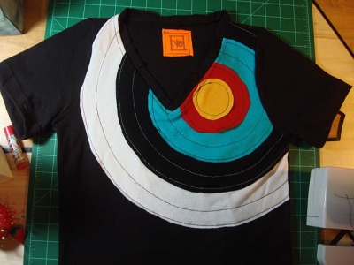 Just finished this new tshirt! Made completely from scratch from recycled thrift-store tshirts, based on my own pattern. I literally just harvested the fabric and constructed an entirely new shirt, vs my first attempt, which used a pre-made tshirt as the base. Do you like archery targets? Me too. I thought it would make a nice inspiration for this design.
I really upped the anti on quality with this version, taking care to reinforce every seam, and include a finished v-neck, which was challenging but I think makes the shirt look much more professional.

Sewing the target onto the shirt, and here are some sketches for future ideas.

It fits!

Trying out a label idea.
Saturday, February 26, 2011
Geometric Furniture
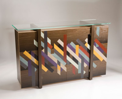 Amazing furniture from Patternity. The geometric qualities are achieved with dyed inlayed wood.

Saturday, February 12, 2011
Dramatic and Effortlessly cool: Rachel Comey's models showcase their natural beauty as well as her Fall 2011 Collection
 A stand-out from Fashion Week, Designer Rachel Comey’s models wore no makeup while exhibiting her Fall 2011 Collection.
“The look was both dramatic and effortlessly cool—a refreshing break from the coal-lined eyes and generous makeup application we’re used to for the Fall runway.” -Refinery29.com


Gorgeous!
Thursday, February 10, 2011
Wednesday, February 9, 2011
My first attempt at making a custom recycled tshirt!
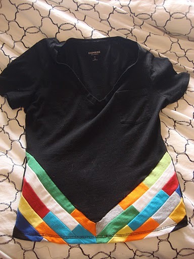
My first hand-made recycled shirt! I used quilting techniques to craft the chevron design from a pallet of thrift-store tshirts. This is more of a prototype, but I think the idea might apply well to dresses, jackets, hoodies etc.


Friday, February 4, 2011
Toy Tokyo
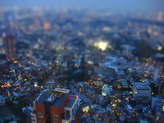
Tilt-Shift Tokyo! 2009
Taken during last year’s Japan trip, from the CityView on top of Roppongi Tower.
Taken during last year’s Japan trip, from the CityView on top of Roppongi Tower.
Toy Tokyo
Tilt-Shift Tokyo! 2009
Taken during last year’s Japan trip, from the CityView on top of Roppongi Tower.
Taken during last year’s Japan trip, from the CityView on top of Roppongi Tower.
Drowning in Possibility
"Drowning in Possibility": The Wired on why distractable people are more creative
As an artist, distractability is a constant uphill battle. I found this article from The Wired to be so enlightening.
How being easily distracted allows us to be more creative, the importance of curating our thoughts, and how this relates to the modern culture of social media.
I love that phrase, "curating our thoughts".
How being easily distracted allows us to be more creative, the importance of curating our thoughts, and how this relates to the modern culture of social media.
I love that phrase, "curating our thoughts".
Thursday, January 27, 2011
Printmaker Yuko Hama at the O Gallery
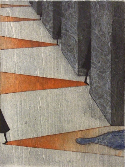 Wood print and etching by Yuko Hama, featured at the O Gallery in The Ginza, Tokyo.
I had the pleasure of meeting this young printmaker on one of my Tokyo art excursions.

She was kind enough to explain to me her process of layering wood relief prints under a final layer of etching. Her pieces have a wonderful sense of narrative to them that I find really engaging.


As a personal reflection, I think part of the charm in her work is similar to that dark whimsy I find in Edward Gorey’s illustrations that inspired the introduction to the PBS show “Mystery!”. The subject matter both artists create is wisely gloomy without taking itself too seriously.

The artist herself, this photo taken by the OGallery. Click the image to view the translated Gallery’s website.
For more information on Ms. Hama, just click on the ‘exhibition’ area of the gallery website where you will find more images of her work as well as her C/V!
Wednesday, January 26, 2011
Illustrated Book of Japanese Monsters, 1972
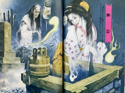 Yūrei (ghost), Illustrated Book of Japanese Monsters, 1972
 Tabaimo “Te Te Te” at Gallery Koyanagi

Gallery Koyanagi was a little tricky for me to find at first, but so very rewarding. The current exhibit (that ended the day after I saw it) featured the artist Tabaimo, in her show “Te Te Te”. The gallery’s description of the show called it “an exhibition to commemorate a set of illustrations produced for Suichi Yashida’s book “Akunin”, featuring new drawings and other works that depict the touch and sensation of one’s hand.”
Being only the second gallery and show that I had seen in Japan, I couldnt keep from thinking about how I almost passed over this gallery, only to have missed such a professional and profound exhibit featuring one of Japan’s most talented contemporary artists.
Drawing is my personal favorite means of expression, and it was very exciting to me to see an artist that pushes the boundaries of that medium. In her more traditional pieces, large sheets of handmade paper are adhered to each other, forming layers in which rough windows are cut or torn away, revealing the detailed layers of drawings underneath. Each of these pieces is roughly 4x5ft.


In this piece, layers of rice paper are adorned with drawings of insect wings, then adhered to create opacity and a sense of depth.


“Te Te Te” is a celebration of the completion of a collection of drawings Tabaimo created for Suichi Yashida’s book “Akunin”. Most of the illustrations are small and created with traditional Japanese ink on illustration board. Each piece is a surreal exploration of manipulated anatomy and the human condition. Altered images of the human body are merged with iconic imagery associated with modern Japanese life, and in this way, contemporary Japanese culture is dissected, its darker aspects analyzed.

Here is the complete book. I purchased it for about 18000yen at the gallery’s front desk. It is such a little treasure, with each page a little masterpiece. Worth every penny, or 1 yen coin, or whatever.


The show also featured several pieces that were related thematically to the book, but were not part of the series of included illustrations. In this series, the artists uses Japanese ink to draw on to pig skin, which is then treated like embroidery fabric. As a finishing touch, human hair is needle-pointed into the skin to complete the piece.

The artist’s use of hair references the cultural significance placed upon hair in Japan and other Asian cultures. In many Japanese horror stories and movies, hair is used as a way of indicating the nature of a ghost. In “The RIng”, originally a Japanese book and film before it was adapted for American audiences, the long, damp, matted hair of the ghost indicates that she was feral and neglected, and often disembodied locks of her hair appear throughout the story, almost like a warning or a premonition.

Also featured, were a few altered books that the artist created. The 3-Dimensional brain in this piece is comprised of about 100 pages in the book, each hand cut to create the recognizable topography lobes and folds.

Reflecting upon the exhibit, I feel that I experienced a very satisfying balance of pieces that addressed very universal themes, as well as pieces that reflected a very insular visual vocabulary exclusive to this region. Similar to the symbolic imagery associated with Western Religious Iconography or with 15th Century Netherlandish Portraiture, Japan has a large bank of inherited imagery. We are all familiar with the incorporation of the floating horizons of Ukiyo-e prints, or the nautical imagery and textile patterns often referenced in contemporary Asian artwork (and it Western art and design as well), but Tabaimo seeks to incorporate into that heritage the mundane and utilitarian symbolism seen in subways, streets and vending machines, illuminating and informing contemporary Japan.
For more information on the artists Tabaimo, check out this great interview between her and the Tokyo Art Beat, an amazingly developed, updated and informed bilingual website and community that provides a centralized directory and voice for the galleries, events and venues in the Tokyo area.
My Introduction to Art in The Ginza, Tokyo

My two day excursion to The Ginza was my second solo venture into the Tokyo area from my friend’s little apartment in Kita-Narashino. After being completely confused by the trains (which are actually not confusing at all once you start to understand the system) I finally arrived around dusk in one of the most expensive, upscale areas in Tokyo. The largest street in the area is Chuo-Dori, which is bejeweled with upscale retail like as Louis Vutton, Chanel, Hermes, De Beers, Tiffany and Apple.

That is a giant movie screen

Most of the customers were white people
I was under the misguided impression that the instructions I had written down from Google would be sufficient enough to find the first gallery, and from there I could grab a map or brochure to find the rest of the galleries on a list I had put together from the Tokyo Art Beat website.
False.
I wasted a precious hour and a half wandering around all the back streets, wondering if these elusive galleries existed at all, when all of the sudden my eyes refocused to a sight right in front of my face that I recognized as one of the galleries on my list, Gallery G2.

Though basically the size of a walk-in closet, this little gallery was well maintained by a sweet owner who, lucky for me, spoke English. The current show features artists Moriya Reiko and Nakamura Shigeru. Most of the paintings were part of a series called ‘Cosmos’ that depicted images of nebulae and stars created with rhinestones and glitter, but one of the more interesting pieces was the painting of this female figure:


Though I question the intentionality, I really enjoy the texture of the surface, the torn bits of canvas acting as muted embellishments, and the rhinestones surprisingly not distracting from the overall impression that this piece is about something a bit deeper.
From what I can tell on the gallery’s website, the shows they feature range from fairly interesting and high-brow, to very kitschy. Either way, the owner was kind enough to provide me with directions to the next gallery on my list, and A MAP of all the major galleries in the area!
I was able to visit at least four more galleries that evening before they all closed at 7pm. Amongst them were the Canon photo gallery, who’s current exhibit is called “Soul Brothers” and features beautiful black and white photographs by Yoshihiro Tatsuki, postwar photojournalist Emile Muller, and French photographer Bernard Matussiere, who studied under both Tatsuki and Muller.

It was a lovely, if somewhat cold, collection of some of History’s more important photographs, but I was not permitted to photograph the exhibit so I just enjoyed the viewing and moved on.
Another gallery I was able to hunt down was K’s Gallery, another one-room gallery featuring the pieces by Ryoko Fukao. While the artist’s paintings were very reminiscent of Jean-Michel Basquiat’s linear works, my favorite pieces were these tiny paper creations:

I really liked the simplicity of the crisp lines and arrows cut away carefully from the top layer to reveal the hidden layer of magazine images.

Yeah that’s my reflection, hi guys!

I visited two more galleries this evening, Gallery Koyanagi featuring the young Japanese artist Tabaimo who participated in the Venice Biennial and the O Gallery, where I met Yuko Hama, an accomplished young printmaker who was kind enough to share her process with me. Both of these shows were awesome and deserve their own post, so stay tuned!
Subscribe to:
Comments (Atom)

